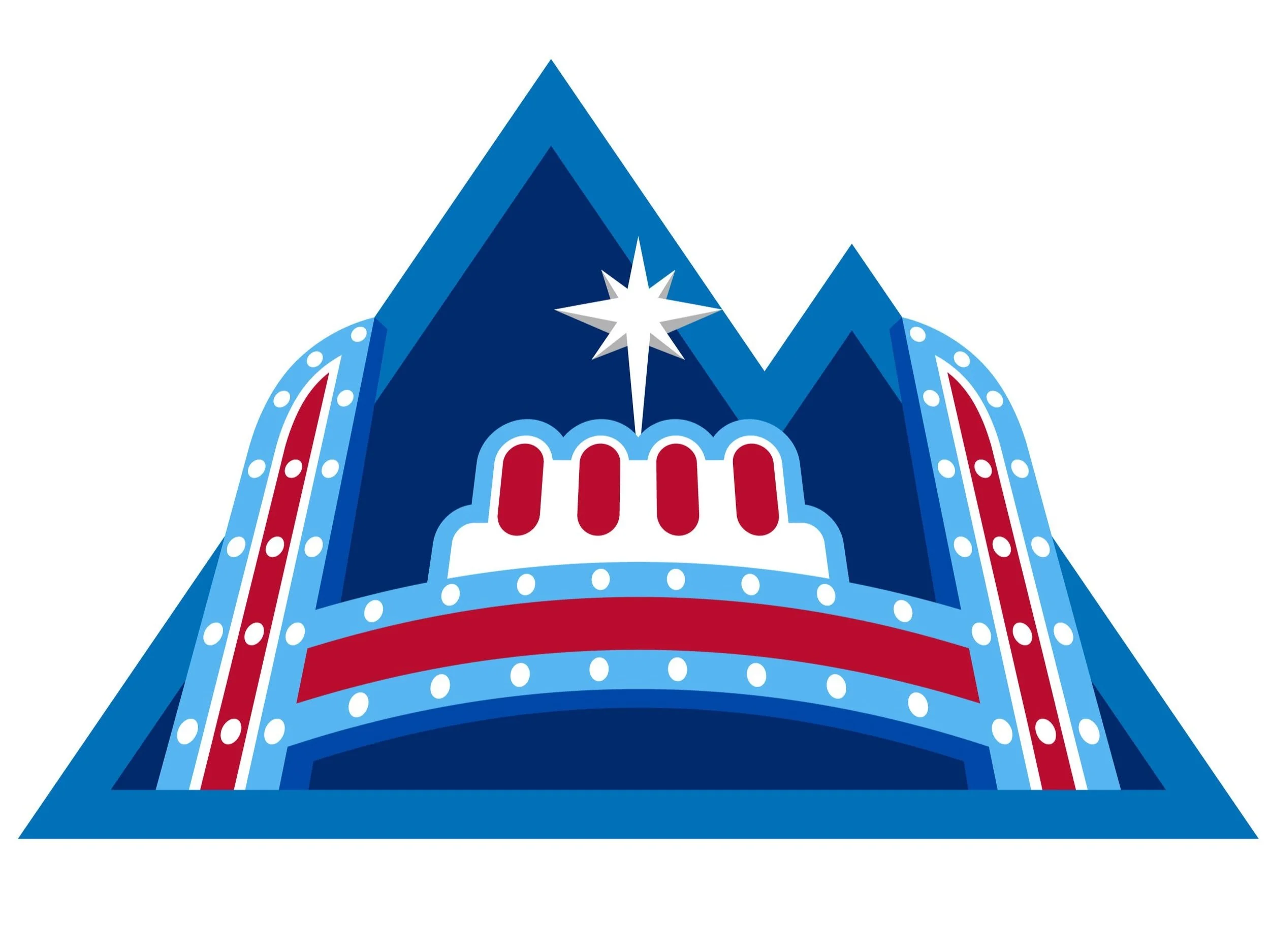
COORS LIGHT LOCALIZATIONS
Coors Light presented us with an exciting opportunity to blend regional identity with the brand’s visual language in a really fun way. We focused on creating a series of icons that not only represented the unique cultural and geographical aspects of each state but also stayed true to Coors Light’s modern and clean design aesthetic. The challenge was to craft illustrations that felt local and authentic, while maintaining consistency with the brand’s overall look and feel. The final result was a set of vibrant, detailed icons that resonated with consumers on a personal level, reinforcing Coors Light’s connection to diverse communities. This list is constantly updating so MORE TO COME!
Completed under (ACD+CD): Mandy Lattin, Bianca Bertolini